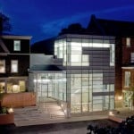
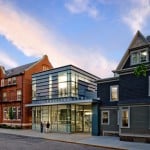
If not for the dynamic design of the Wheeler School’s Nulman Lewis Student Center (above), a visitor could almost miss it, tucked as it is into a 60-foot gap between two older buildings on the campus. But this was the point, to fit the structure perfectly to its site by considering site limitations, environmental elements, and orientation for proper daylighting and ventilation. From designing in a dense urban location to working within a wooded landscape to accounting for sweeping mountain views, three compelling projects have caught the eye of American Builders Quarterly as standout examples of site integration done right.
1
Nulman Lewis
Student Center
Location: Providence, RI
Architect: Ann Beha Architects
Builder: Agostini/Bacon Construction
Completed: 2009
Size: 5,000 square feet
Cost: $3.8 million
When tasked with designing a new student center for an independent day school located in the heart of Providence, Rhode Island’s historical district, the team at Ann Beha Architects knew finding space would be the principal issue. Founded in 1889, The Wheeler School is located on an extremely tight plot of land—spanning one city block—and consists of several buildings and minimal open space, so when Ann Beha began planning, there was no apparent room for expansion.
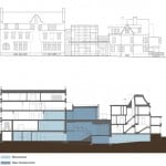
A playground located at the northwest corner of the campus seemed the obvious choice for the site of the new building, but the architects’ campus-planning strategy advocated against using the open space. “Our advice to the school was to hold on to the large open corner of the campus as a very valuable place for day-to-day outdoor activities and instead to use the smaller gaps between the existing buildings for any new construction,” says Thomas Hotaling, one of Ann Beha’s principals. Following through with this strategy, the firm selected a 60-foot-wide space between the school’s Alumni House and Student Union buildings that had previously been used for dumpsters and other maintenance needs. “It was a unique space,” says Jason Bowers, another architect with the firm, “and not one where the school had ever thought of siting a new building.”
With the help of Agostini/Bacon Construction Companies, Inc., the team set out to construct the building on the improbable site, which was also situated between a line of sidewalk at its front and a small courtyard at its rear. The construction team was only able to work in a very restricted area near the courtyard and had to avoid building from the front. “We didn’t have much of a lay-down area for stockpile of materials and storage,” says Pat Zarlenga, senior estimator and engineer at Agostini/Bacon. The limited workspace made material deliveries difficult, so concrete had to be brought down a side street that was very active with school buses during the day, and it could only happen during specific hours.
From the courtyard area, the crew had to open the walls of the existing buildings and shore up their sides to install a new foundation. “In order for the addition to work, the foundations had to be four to five feet below
the existing basement floor of the old buildings that the addition would connect to,” Zarlenga says. Each piece of foundation was incredibly intricate due to the added support framing that the team had to install throughout.
The end result, now known as the Nulman Lewis Student Center, sits in contemporary juxtaposition to its historical surroundings. It’s transparent exterior livens up Meeting Street, with the school on one side and an open field located across the street on the Brown University campus. The building is now the central pick-up and drop-off location for students, and it serves as a new dining facility and a convenient link between the other two campus buildings. And, designed to LEED standards with a green roof, the building has also become a stand-out, ever-present teaching tool for the school’s environmental sustainability curriculum.
2
Ruth Lilly
Visitors Pavilion
Location: Indianapolis, IN
Architect: Marlon Blackwell Architect
Landscape Architect: Landscape Studio
Builder: The Hagerman Group
Completed: 2010
Size: 3,980 square feet
Cost: $2.3 million
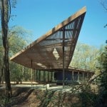
The 100-acre peninsula located next door to the Indianapolis Museum of Art hadn’t been touched since the 1950s—deemed unsuitable for construction and overrun with woodlands. In 2006, though, the museum hired Arkansas-based architecture firm Marlon Blackwell Architect (MBA) and Ed Blake of Landscape Studio (based in Hattiesburg, Mississippi) to explore the possibility of using the lot as a nature park and to investigate whether or not the space would be suitable for construction. The firms’ findings weren’t exactly favorable. “Of the 100 acres in the park, only two-thirds of an acre supported putting a building on it,” MBA project manager Jonathan Boelkins says.
The museum decided to transform the area into a beautiful park (known as 100 Acres: The Virginia B. Fairbanks Art & Nature Park) while using the small space available to construct the Ruth Lilly Visitors Pavilion—a place where park visitors could relax while escaping the heat or cold (depending on the season) and use restrooms or emergency services. The museum also wanted the pavilion built to host temporary gallery shows, donor dinners, and educational programs. “For it to be part of the museum, it needed a level of refinement that was indicative of its relationship to the museum—but also needed a great deal of flexibility,” Boelkins says.
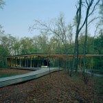
Designing on such a restricted space wasn’t an easy task for the firm, and the project went through several iterations before arriving at its final design. “It was a challenging project to get built,” Boelkins said. As the area is prone to flooding, the architects had to create a design that would elevate the building to protect it from harm without it looking tacky or overcautious. “We wanted it to be as seamless as possible,” Boelkins said. He and his team used a system of berms designed by Blake to bring the land up to the building, elevating it above the level of intermittent flooding without using railings—or even giving the appearance of elevation.

The team also worked very closely with Blake and the general contracting firm the Hagerman Group to preserve the natural landscape around the construction site. Brett Rose, who served as the Hagerman Group’s project manager, says, “We marked the work site and critical travel areas to and from the construction site with an orange fence so as to minimize or eliminate any more disturbance than was needed to construct the building.”
Rolling paths called “landscape journeys” were designed throughout the park, leading directly to the deck of the building. To preserve the appearance of an untouched landscape, trees were removed selectively, and the logs and branches that had fallen onto the site prior to construction were catalogued and temporarily moved until the building’s completion. They were then reintroduced to the site so that the area surrounding the pavilion still gives the illusion of an untouched woodland.
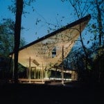
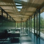
The end result is an impressive, transparent building featuring a continuous screened surface of Ipê wood slats that extend above the deck and terrace area, almost like branches of a tree. Filled with sunlight, the pavilion gives off fantastic views of the woods that surround it, and it has become a popular destination
for visitors from across the Midwest.
3
The Weigel Residence
Location: Copper Mountain, CO
Architect: Substance Architecture
Site Superintendent: Jason Kleinert
Completed: 2007
Size: 4,000 square feet
Cost: $1.2 million
Designing a retreat home amid the pines of the Copper Mountain ski resort in the heart of Colorado was no simple task for Des Moines, Iowa-based firm Substance Architecture. Its clients, the Weigels, sought to build a breathtaking second home for their four children and large extended family—a retreat that would provide unparalleled views of the mountains and the illusion of seclusion despite the houses located across the street. But, the site was tucked away on the lower slopes of the resort and situated in a national forest, surrounded by trees and wetlands, all of which made the construction process extremely delicate.
“There is a road that goes up the west side of the ski slope at Copper Mountain,” says Paul Mankins, one of the firm’s principals. “One side has houses while the other—where the site is located—goes back into the national forest. The house had to be sited in such a way that no construction went outside the property lines [because] the environmental protection in Colorado
is extremely high.”
In order to protect the natural landscape surrounding the quarter-acre lot, located at an elevation of 10,000 feet, the construction area had to be roped off. Mankins says that the constricted construction area made it feel as though he and his team were building in a city environment—there was limited space to bring in and store materials, and they had to come up with inventive ways to build the house. “We couldn’t lay back the hole when building the basement; we had to dig straight down,” he says. Site superintendent and project manager Jason Kleinert adds, “We ended up cutting a pretty good-size basement into a lot of rock.”

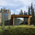
Mankins and his team followed a contemporary design to build the 4,000-square-foot home on a small piece of property. They decided to create two separate spaces for the house—one, a great room with all of the house’s dining and living functions, is a modern structure with large windows, and the other is a conventionally framed four-story tower that contains all the bedrooms and a kitchen area. “The tower produces a chimney effect,” Mankins says. “When you open the windows downstairs, the heat rises and escapes through the windows at the top.”
Substance Architecture also had to take the area’s harsh winter climate into consideration when designing the windows. “All of the storms come in from the Northwest,” Mankins says. “We sited the houses so that there are almost no window openings facing that direction.”
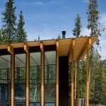
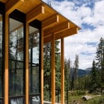
The smaller portion of the house appears to be mostly glass with a wood frame, and this allows the house to serve as a passive-solar home where the sun plays an integral aesthetic role throughout the year. “In the summer, the interior of the house is in the shade from the overhangs,” Mankins says, “but in the winter a lot of sun comes in.” ABQ
