On August 11, 1991, a wild-eyed dog and cat, a gaggle of talking babies, and a shy, awkward eleven-and-a-half-year-old boy appeared on Nickelodeon’s debut trio of original animated series: The Ren & Stimpy Show, Rugrats, and Doug. In the nearly 27 years since, the premier kids entertainment brand has continued to release dozens of other original “Nicktoons,” including the hugely popular SpongeBob SquarePants, to the delight of children everywhere.
Creating all these shows, though, takes an army of animators, writers, and producers, and housing these employees in different facilities all over Los Angeles has historically been a challenge—until recently. In January of last year, Nickelodeon opened a new five-floor, 110,000-square-foot addition to the campus it’s had in Burbank since 1998. The cutting-edge, LEED Gold-certified building has allowed the company to consolidate more than 700 employees working on more than 20 different productions.
Vicki Fenton, Nickelodeon Animation Studios’ vice president of core services, who joined the company in 2011, was present from the first discussions of the project to its ribbon cutting. She sat down with American Builders Quarterly in August 2017 to discuss how the project came together and how its design and amenities are meant to maximize employees’ creativity and productivity.
So, when you started with Nickelodeon, how many different locations was it housing its animation teams in?
They had people in five locations across the city. I was working here at the Burbank office. We had a space right across the alley, 5,000 square feet here, 30,000 square feet up the street, 20,000 square feet in Glendale. I had productions in three buildings in Burbank, and I had groups in Santa Monica. I don’t know if you’ve been to LA, but if you wanted to have a meeting with someone in Santa Monica, it could take all day. This all weighed heavily on the decision to build this new building.
When did brainstorming for the new project really start getting under way?
In 2013, we knew it was going to happen. The budget had been discussed. The timing and scheduling had been discussed. We started the process of hiring architects and project managers.
And what were you doing?
We went to visit production and high-tech companies in Northern California. It was very interesting to see how they use space to create a positive feeling as soon as you walk in the door. We saw many uses of the open floor plan and used that information when planning our work areas. We realized that our challenge was to be as creative as possible within the space.

Did you get design inspiration and advice from Nickelodeon employees, too?
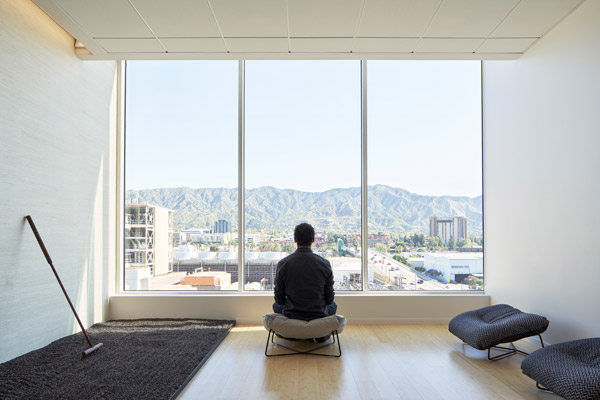
Absolutely. We sent out a survey and received a lot of input. What I’m really proud of is that we were able to incorporate so many of the spaces that were most important to them. People really wanted a place to eat; we have a beautiful café. They wanted a gym; we have a wellness room on the second floor that has equipment, weights, mats. We even have a zen room up on the fifth floor where people practice yoga a couple of times a week.
A lot of the artists said, “We really need natural light.” Some artists didn’t want any light. How do you build a building where certain people get natural light and others work in a dark room? We did it.
Were there also certain types of creative spaces they were asking for?
Definitely. When they built the original space in 1998 nobody was even using the word collaboration. Everybody had their spot, a couple of conference rooms, and that’s it. It was important for us to have spaces—open, closed, big, small—where people could talk to each other.
We have an open plan on floors one and five. The second, third, and fourth floors were designed for production. We designed work stations that are three-sided. It is difficult for artists to work without walls. Many of them hang up source information for reference and inspiration. We used magnetic whiteboard on the outside of every workstation. There’s also a bench now in the back of each workstation so that there’s a place for coworkers who come for a visit.
There are also two makers labs for the artists. What do these rooms include?
One has all of the traditional art supplies: traditional animation desks, paper, pencils, pastels, paints, clay, and stop-motion supplies. The other one has newer technology: a large-format printer; several 3-D printers, including a resin-based printer; workstations with all the software we use at the studio; scanners; and Cintiqs. These rooms are used all the time.
With so many different specialty spaces—a café, a gym, workstations, conference rooms—and the competing needs of staff, how’d you go about fitting it all into the design?
We looked at the space as a whole. We decided not everything needed to go into the new building. For instance, the new arcade and music room are carved out of a space from one of the existing buildings. And, we added a new recording studio, an audition space, a research lab, and an archive library into the other. Our new 23,000-square-foot courtyard is nestled between the buildings and acts as the heart of the campus. It’s got Wi-Fi, power, and shaded seating. Employees are conducting interviews, taking meetings, and working remotely there every day.
The lounge area outside the café has folding doors that open up onto a deck leading to the courtyard. When they’re closed, you would think they’re giant windows, but then they fold open like an accordion and you get this beautiful indoor-outdoor space. Each floor above has a giant balcony that runs along the building so that you have a view into the courtyard.
That sounds so picturesque and relaxing.
The point is to attract and retain talent. That’s the bottom line. You want to be the one with the most creative work space and that’s what we have now.
What was the most challenging space to include in the new addition?
The screening room. We had to plan this state-of-the-art room without having a finalized layout for the interiors yet. We had to study the access, accessibility, A/V capabilities, screen size, and sight-line issues. Also, we had to isolate the slab for it to be acoustically sound. It’s my favorite because we installed an LED ceiling that makes it look like a starry night sky.
Were there any unique elements you included to achieve LEED Gold certification?
We felt very strongly about achieving this certification and are so proud to have it. We had to figure out how to work within the parameters of Title 24, which had just taken effect. We used LED indirect lighting with dimming capabilities and motion-activated lighting throughout the building.
What about the décor? How much of Nickelodeon’s wild aesthetic has been worked into the finished product?
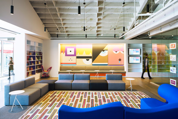
There’s a fine line. We didn’t want it to feel like a preschool. It needed to be thoughtfully done, curated. We strove to incorporate color in a thoughtful way, understanding that you always need some white space.
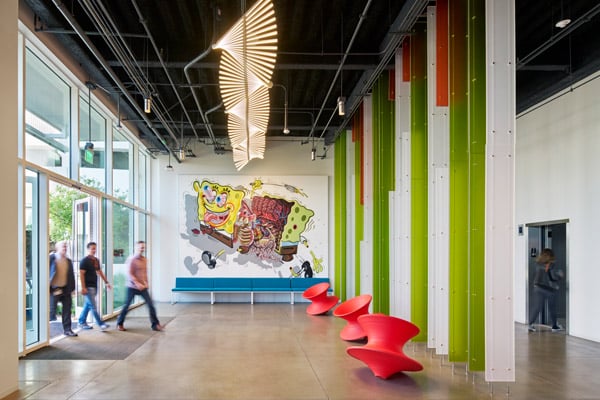
Each floor has its own accent color. The first floor is green, two is orange, three is blue, and four is magenta. Five is more subdued because that’s the executive floor—we used gray, blue, and yellow as accent colors. We used wood on every floor for a warm feel.
It certainly doesn’t look corporate in here, but it looks professional. On floors two, three, four, and five, there are chalkboard walls on one side, completely full of people’s drawings. We have a Hey, Arnold! stoop on the fourth floor, Rugrats characters on five, and indoor swings on the second floor.
Can you feel a difference now that the workforce has been consolidated?
Without a doubt. Just communication-wise, I can’t tell you what a huge difference it makes to have everybody under one roof. We’re all here now, almost everybody who works for Nickelodeon: live-action, animation, development, digital, games, talent and casting, and all the support groups. Everyone is so excited to be together, it’s fantastic!
For over 100 years, McCormick has shaped the culture of buildings and businesses around the Western United States. With an extensive portfolio, McCormick is known for providing cost-effective solutions to the most complex building challenges and offers a full range of services to fit the unique needs of your next project.
