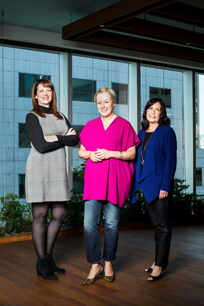
When Elizabeth Pinkham joined Salesforce in 2000, the company operated out of one floor of the Rincon Annex, an old post office building in San Francisco. At the time, the customer relationship management solutions provider was a year-old company. “We didn’t even have a website. We didn’t have a logo,” Pinkham says. “It was all about getting the product out and getting the word out.”
Pinkham began working on events at a time when tech companies traditionally held separate seminars for customers and prospects. The intention was to keep prospects from hearing any negative feedback, but Pinkham soon found that isolating customers silenced an essential marketing voice. “Our customers were truly our best spokespeople,” she says. In 2003, Salesforce launched Dreamforce, an annual conference for customers and prospects alike in the heart of San Francisco.
It was at the 2015 Dreamforce, standing among 150,000 attendees, that the idea for redesigning the company’s offices was born. “So much thoughtfulness and energy and careful curation goes into the brand experience [at Dreamforce] that everybody feels like they can understand the messages,” Pinkham says. “Our CEO said, ‘This is what we really want in our real estate.’”
When Pinkham became executive vice president of global real estate in 2016, she brought the lessons she’d learned from creating Dreamforce to the redesign of Salesforce’s global offices. The goal of the redesign was to create a cohesive aesthetic that would demonstrate Salesforce’s vision and unify its employees. “You enter our doors anywhere around the world, and it’s going to be one Salesforce,” Pinkham says. “You’re going to know when you cross that threshold where you are.”
Because the company had grown so quickly, and because its focus had been on customer success, Salesforce had an eclectic range of office designs. The various designs reflected the company’s evolving vision and the trends of the previous decade, with bright colors and stimulating environments. “It felt like a very different Salesforce depending where you were,” Pinkham says.

Feedback from employees indicated a desire for a calmer, more focused look, so Pinkham worked with the color expert Donald Kaufman to design a more subdued color palette. The palette was one part of what Salesforce came to call the Ohana Design, named for the Hawaiian cultural concept of family, which is a touchstone of the company’s culture.
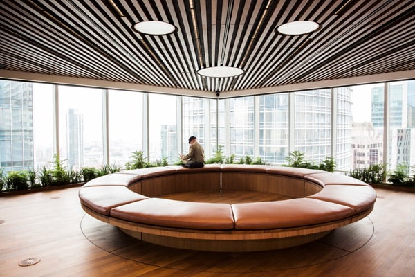
Salesforce partnered with the architecture firm Mark Cavagnero Associates and the residential interior design firm the Wiseman Group to bring the Ohana Design to life. “We envisioned a space that was something you wouldn’t see in any other corporate offices,” said Mark Cavagnero, principal of Mark Cavagnero Associates. “The concept is warm, social, energetic, and convivial. It is unique to Salesforce’s vision, values, and commitment to their customers and employees.” Along with natural colors, the Ohana Design incorporates natural materials, such as the real wood tables in the gathering spaces. The floors are covered in a green and gray carpet that evokes a lawn with a gravel path running through it. Private offices are concentrated in the center of the floors and the surrounding workstations extend out to the windows, increasing employees’ access to natural light.

To make the Ohana design truly feel like home to Salesforce’s employees, the plan draws inspiration from residential spaces. The design team expanded the typical office kitchen to create a dining area with wooden, farm-style tables where groups can gather for meals or meetings. Beside the kitchen is a living room-inspired space with couches, armchairs, and bookcases. For younger employees, who often prefer not to sit at the same desk every day, these areas provide a range of workspaces and lend variety and comfort to the traditional office layout. “We wanted this to feel more like a home than a workplace,” Pinkham says. “You stand [at the intersection] and you see the kitchen and the dining room and the living room vignettes within one cohesive space.”
The Ohana design began as a way to bring employee workspaces into alignment, but Salesforce’s extended family includes the communities around its offices as well. Instead of dedicating the top floors of its largest towers to executive offices, Salesforce is turning those prime spaces into community hubs called Ohana Floors. The first Ohana Floor, which opened in San Francisco in September 2017, has an exhibition kitchen with an executive chef and a chef’s table where employees can have private dinners with top customers or lunch with colleagues. The floor was originally a garden space and is populated with over 5,000 plants. “There’s an energy up there that’s incredible,” Pinkham says.
As an event organizer, Pinkham is used to building spaces that will be used for a few days. The offices, by contrast, are built to last for years and to serve an evolving organization. “When you’re running an event, you know exactly how [the space] is going to be used for that day or for that week,” Pinkham says. “In the case of these spaces, we have to think, where is the company going to be in two years, three years, five years?”
The office floors are designed to adapt as needed. Furniture can be moved to accommodate product launches or employee recognition lunches and returned to their original positions for the next workday. “We’re putting a lot into the construction and design of these spaces, and we want them to be used as much as possible,” Pinkham says
Salesforce has come a long way from its early days in a former post office building, but its emphasis remains on sharing its solutions, broadening its community, and building spaces where people can come together. “It’s really about being able to take everything the company is about and to help bring it to life in a very physical, tangible way,” Pinkham says. “That’s what we’ve done in events, if you think about it—this is just on a bigger scale.”
Photos: Gillian Fry, Courtesy of Salesforce


