In 1916, New York City passed a zoning resolution that required buildings to be set back from the street at a distance proportional to their height; the taller the building, the farther from the street it had to (and still has to) be. The goal of this resolution was to protect light and air at street level, and for the most part, it has worked. But, says Weston Walker, “the zoning never anticipated the High Line.”
The hugely popular elevated public park, built on a former freight line, has presented a unique challenge and a significant opportunity for Weston Walker, design principal at architecture and urbanism practice Studio Gang: he’s designing a building, 40 Tenth Avenue, that overlooks it. The building, scheduled to open in 2019, is located at 10th Avenue, with 14th Street to the north, 13th Street to the south, and the High Line directly to the east.

In and Around
According to the 1916 zoning requirements, the building must be set back from the three adjacent streets, pressing it up against the High Line at a portion of the park that’s already flanked by towers. “Before we develop what’s going on inside our building, it’s a critical part of our design process to think about what’s going on around our building,” Walker says. “We came pretty quickly to the conclusion that we were going to need to do something different in order to protect the public space of the High Line.”
To do so, Studio Gang decided to build as close as possible to 10th Avenue, which required variances from the city to work around the zoning laws. Because the development site is at the edge of Manhattan, with only a three-story building and two streets separating it from the Hudson River, 10th Avenue would have access to light regardless of the building’s position. “[We didn’t] just follow the zoning regulations but rather tried to distill the intent of the zoning—which is to protect light and air and the quality of the city’s shared spaces—and to propose a solution that is in that spirit,” Walker says.
Here Comes the Sun
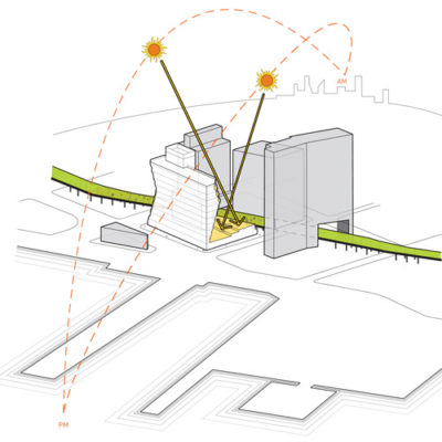
Even set away from the High Line, a conventional tower would block the park’s access to light, so Walker and his team cut into the building’s mass using a technique they called solar carving. They analyzed the sun’s path and identified the building shape that would allow the most solar access to the High Line. Then, they presented their plan to New York City’s Board of Standards and Appeals and were granted the necessary variances.
The High Line isn’t the only thread that runs through the project’s particular city block. The development also sits on the edge of Manhattan’s original shoreline, which means that half the site is original soil and half is fill. The shoreline presents additional challenges, but primarily its poor soil conditions, common throughout Manhattan, lead to water leaking into the foundation.
“As you excavate, you need to de-water the site constantly so that your excavation pit isn’t filling up with water, and you need to design your foundation to resist the pressure of the water pushing against the foundation walls,” Walker says. “It adds time and cost to a part of the building that you never see.”
In addition to managing subpar soil conditions, Walker’s team had to avoid impeding on the foundations of surrounding structures, including the High Line. They partnered with Friends of the High Line and the New York City Parks Department to ensure that construction would not damage the park and that maintenance crews would have complete and continuous access.
 History And Future
This partnership was essential to preserving both the High Line and the relationship between the building and the public space. “There was going to be a building on this site no matter what,” Walker says. “So, the question was, How do we do the most sensitive building? What can we do as architects to protect and enhance this incredible public resource?”
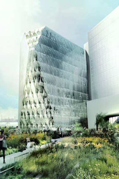
The building’s design elements nod to both the neighborhood’s history and its future. The entry level includes metal detailing around the canopies, doorframes, and loading areas, harkening back to the Meatpacking District’s industrial past. Higher up, Walker and his team accentuated the building’s atypical shape with high-performance, three-dimensional faceted glass. “In the carved areas where the façade is not vertical, we have a different kind of curtain-wall shape made out of angled pieces of glass that gives a finer texture and play of light to the carved areas, basically turning the concept of the building into its design feature,” Walker says.
He and his team conceptually extended the High Line by including outdoor spaces along the building’s vertical plane. A large terrace on the second story, smaller terraces on the higher levels, and a shared, landscaped roof complement the High Line below. “We’re thinking about a thread of outdoor spaces going in the vertical direction,” Walker says. “You have outdoor spaces associated with each of the office plates for people working in the building to step outside and enjoy the incredible view.”
In designing 40 Tenth Avenue, Walker and his team found alternatives to the expected architectural response and instead designed a solution that addressed the deeper concerns of a century-old resolution. This level of intentional design is a key part of Studio Gang’s practice. “Our process always includes that step where we go deep into the context and look at the history of a site and the culture of a place,” Walker says. “Through that process of research, we can come up with solutions that are hopefully beautiful but that also make true, measurable, positive impacts on the places in which they sit.”
 History And Future

