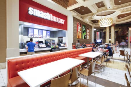
For many chain restaurants, it’s easy to imagine the design as static—a rote process of replicating the same look and feel over and over. This isn’t the case with Smashburger, a smart-casual burger outlet launched in Colorado in 2007 that now boasts locations in 37 states and nine countries. Although the warm tones and many other elements of the restaurant’s basic design are recognizable from one location to the other, customers also encounter a bevy of distinctive touches—all inspired by local culture and preferences.
At the helm of this balancing act is Jenn Allstun, Smashburger’s senior director of design. A Colorado native, Allstun came to Smashburger in 2012 from Starbucks, where she was a regional design manager. After working for the company for six years, she decided to return to her native state to be near family again. A reunion with a former colleague who was building a Smashburger in Florida led to a fateful discovery: the company had no actual design department. Allstun’s contact offered to forward her résumé to leadership. Two weeks later, Allstun had a phone interview and was hired as Smashburger’s first director of design. Although the company may be smaller than the coffee behemoth, the job itself is far bigger.
“When I worked for Starbucks, I was one of six designers for our region, and there were 250 designers overall,” she says. “We worked with real estate and construction, but we were only responsible for a portion of the stores. Here, I am included in every single restaurant we touch, whether it’s corporate, franchise, or non-traditional—and I have a staff of designers under me.”
The design department isn’t the only area of growth, however. The company, which consisted of a staff of merely 35 or so when Allstun arrived, has since ballooned to more than 100. In terms of physical restaurants, Smashburger opens an average of 60–80 restaurants every year. These restaurants open in shopping plazas, food courts, airports, and universities, creating an enormous variety for Allstun and her team—both in terms of square footage and integration into different environments. It’s a challenge she finds invigorating, as with the company’s massive installation at the Denver airport.
“The kind of breadth you can have in design in the non-traditional spaces is amazing,” she says. “Our spaces can be from 600 square feet to 3,500 square feet, and it can be at a food court or in an airport with a full-service bar and lounge. There’s a ton of variety.”
Smashburger hopes to have a freestanding prototype design ready in late 2017, but until then, Allstun sees these non-traditional locations as a great opportunity to build brand recognition and understanding.
“We’re finding that a lot of people don’t know why we’re called Smashburger,” she says. “The best way is storytelling and messaging in-store and out [of the] store, so people can understand why we’re the new way to burger and why we’re the burger of the future.”
In designing the restaurants, Allstun and her team work to tailor the design to the needs of the particular location. At universities, for example, they’ll have more communal tables for groups of students and plenty of outlets for the millennials’ omnipresent laptops and phones. Visitors to a location at a suburban strip mall, on the other hand, will find more flexible seating where large groups or families can pull tables together.
“We think carefully about every single site we go to and who the customer is,” she says.
The principle holds not just in function, but in form as well. Local artwork or locally relevant artwork is hung throughout each space. One might see a photo of the Rocky Mountains in a Colorado restaurant, but not in Texas or the UK, where the Alamo or the Thames, respectively, would be more appropriate. The company has also created a design-option catalog for franchisees. Each catalogue contains the core design model, but also add-on features to fit the milieu. If the restaurant is opening in an affluent mall, options are available to make the design more high-end in order to harmonize with the mall’s luxury outlets.
“We are a chain, but we want to tailor it to the customer’s needs,” Allstun says. “We want to sell the experience of who we are, but also to have people feel that this is their Smashburger.”
Perhaps the best example of this principle at work—and how much energy is put toward it—is the company’s Manhattan location. As most Smashburgers are in suburban locations, Allstun knew that the model would have to be substantially altered to work in such an urban setting. Allstun flew to New York and toured all five boroughs, seeing more than 80 restaurants in all. She watched how customers queued, how they ate, if they stood at counters or all sat together. Allstun took notes and pictures, brought them back to Colorado, and the team started brainstorming.
Ultimately, they settled on a space that was formerly a comic book store, across from the Empire State Building. In the build, Allstun’s team used bulletproof materials that could stand up to a high-volume operation. They took down a mezzanine and kept all of the structural beams, using them as the bases for the tabletops and counters, which created an urban feel. For the first time, a double-cook line was implemented to handle the volume. Coolers, freezers, and dry storage were all moved to the basement to open up more space in the restaurant for seating.
“We made it urban, but also as New York and as green as possible by reusing materials from the existing structure,” Allstun says.
The company did go through a redesign in 2013, but as more and more restaurants open, it saw an opening for another redesign in 2017.
“We sell a premium product, and we want the design to reflect that,” Allstun says. “In 2013, we saw amazing results in customer satisfaction scores [which were] going up with our new design. We want to stay relevant and keep that energy and modernity going.”


